
Confluence Music Fest is a citywide Charlotte music festival, launched in 2026 as the sibling brand to Confluence Carolinas. Engaged by Rick Thurmond and the Charlotte Center City Partners team, the work covered strategy, brand identity, and visual system for a festival that needed to introduce itself as its own thing to a general Charlotte audience. First edition ran October 2026, including the new Saturday outdoor stage in South End.
Brief:
Build a festival brand that carries the family tie to Confluence Carolinas but speaks directly to Charlotte music fans. Loud where the conference is sharp. Warm where the conference is expert-facing. A brand that reads as an invitation to the whole city.
Problem:
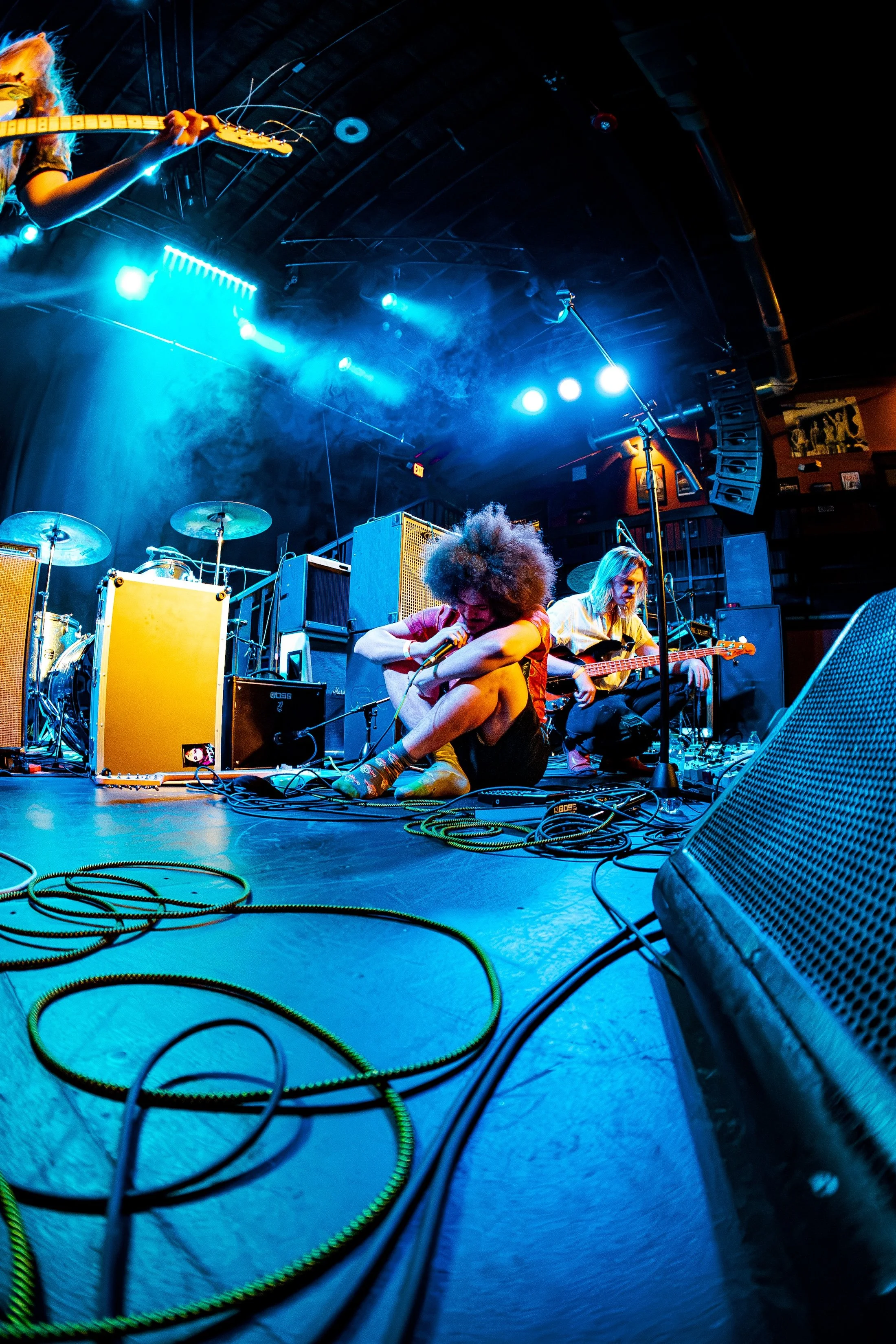
The festival had existed inside Confluence for three years and had been consistently misread. People who were exactly the right audience (Charlotte music fans, show-goers, people who follow local venues) thought Confluence was not for them.
Three problems compounded:
The festival had never been branded to fans. Everything they had seen was industry-facing, which read as closed. Breaking through to a new audience meant building a brand that looked and sounded explicitly like theirs.
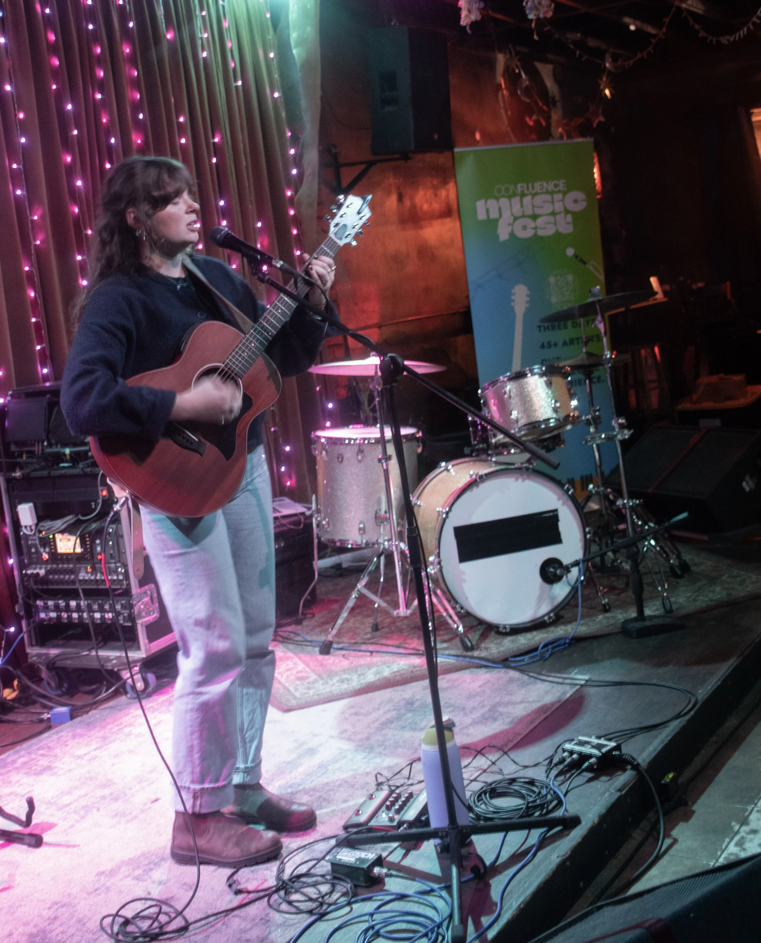
The 2026 edition added an outdoor festival stage in South End, Charlotte’s most trafficked neighborhood for live music and nightlife. First-time festival-goers who happened to walk by needed to immediately understand what they were looking at and feel welcome inside it.
The relationship between the festival and the parent conference had to be visible but not dominant. Lollapalooza Berlin works because Lolla is small on the mark; Berlin leads. Confluence Music Fest needed the same proportional logic: Music Fest leads, Confluence connects.
Solution:
Design the festival as its own brand, with its own typography, color temperature, and illustration language, built to live next to Confluence Carolinas without being a smaller version of it. The sibling relationship lives in the typography system and a single anchor color. Everything else is the festival’s own.
Charlotte already has festival-adjacent competition (large touring festivals, free city-run events, individual venue-driven show nights).
Confluence Music Fest is none of these. It is a Charlotte-specific, multi-venue showcase that treats the whole city as the festival ground. The brand had to communicate that distinction visually.
This meant:
A typeface that read as festival energy without reading as generic festival. Climate Crisis was chosen for its confident, condensed weight, slight italic lean, and warmth in the terminals. It feels hand-set rather than templated.
A color palette that carried the brightness and energy the conference had retired. Neon green, electric blue, bright orange, and mustard yellow. The exact palette that was impossible to reproduce consistently across print for a corporate conference became a strength for a festival brand where color variation reads as authentic.
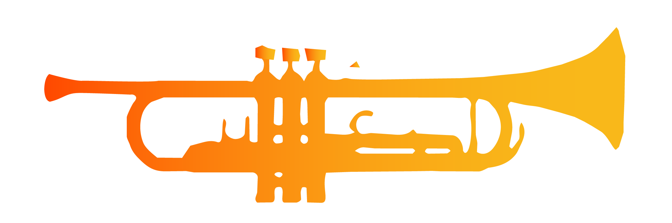
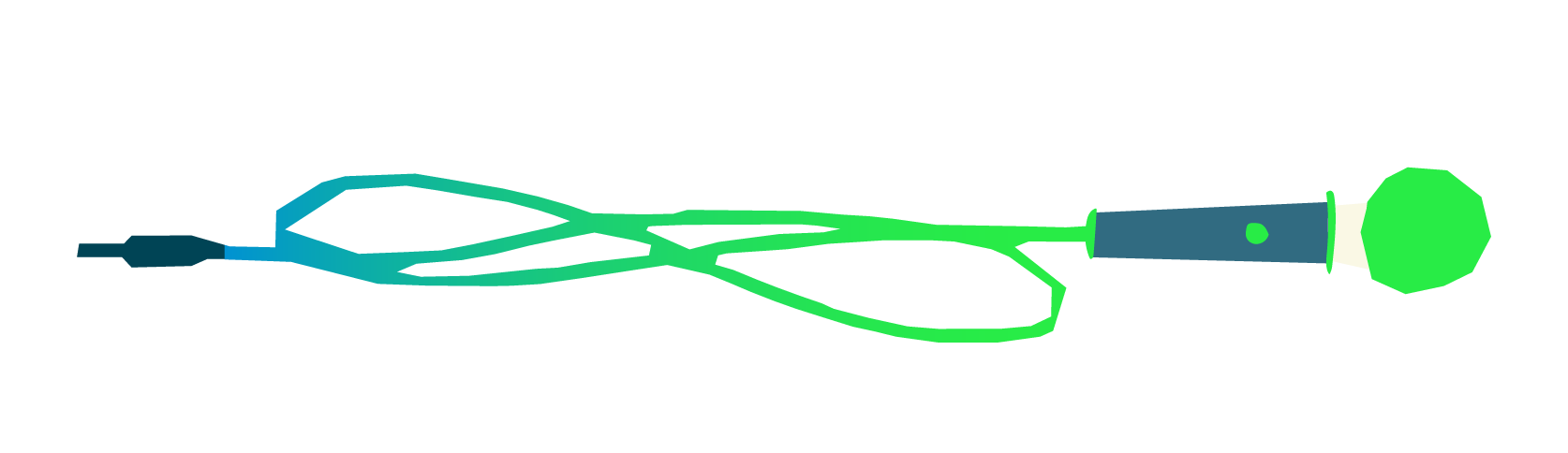
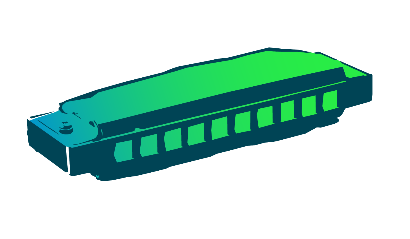
A bespoke illustration image bank built from gig-poster tradition. Hand-drawn linework, bright color fills, imperfect shapes. Headphones, microphones, trumpets, music notes. Illustration that could have been made on a Risograph in the back of a record store, not generated by a template.
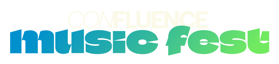
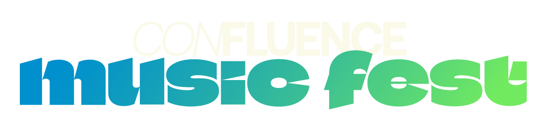
A stacked lockup where Music Fest leads visually and the Confluence wordmark sits above as a smaller family marker. The sibling relationship is present without being heavy-handed.
Execution Work Associated With the Solution Brand Built
Brand Architecture & Positioning
Established the sibling-brand relationship between Confluence Carolinas and Confluence Music Fest, including the visual hierarchy (Music Fest leads, Confluence supports as family marker), the shared assets (Aeonik Bold, deep teal anchor, sound wave mark), and the independent assets (Climate Crisis wordmark, brightened palette, illustration library).
Typographic Identity
Selected and set Climate Crisis as the Music Fest wordmark face, with the Confluence wordmark paired above in deep teal. The stacked configuration became the primary lockup across all applications. Supporting typography (Aeonik Bold and Jost) carries over from the conference, binding the two brands at the system level.
Color System
Inherited the brighter colors from the previous Confluence palette and pushed them further for the festival. Neon green, electric blue, bright orange, and mustard yellow as primary. Deep teal retained only as the Confluence marker color inside the lockup. Warm cream as the base rather than white, giving the brand a hand-printed, paper-forward feeling.
Illustration Library
Built a library of hand-drawn illustration elements for the festival: stylized headphones, vintage microphones, trumpets, music notes, sound wave textures. Loose linework, imperfect shapes, bright fills. The illustrations do the work of carrying personality where typography and color set the register.
Social & Announcement Templates
Produced social templates for the 2026 announce campaign including individual artist announcement tiles, lineup reveals, countdown graphics, and venue spotlights. Built in Canva for the team to execute independently, with the illustration library embedded so new artist announcements could be produced without starting from a blank page each time.
Poster System
Designed the core poster system, including the main event announcement poster and individual show posters for each venue night. The posters established the festival’s visual voice across print and became the template for everything from printed programs to Instagram tiles.