
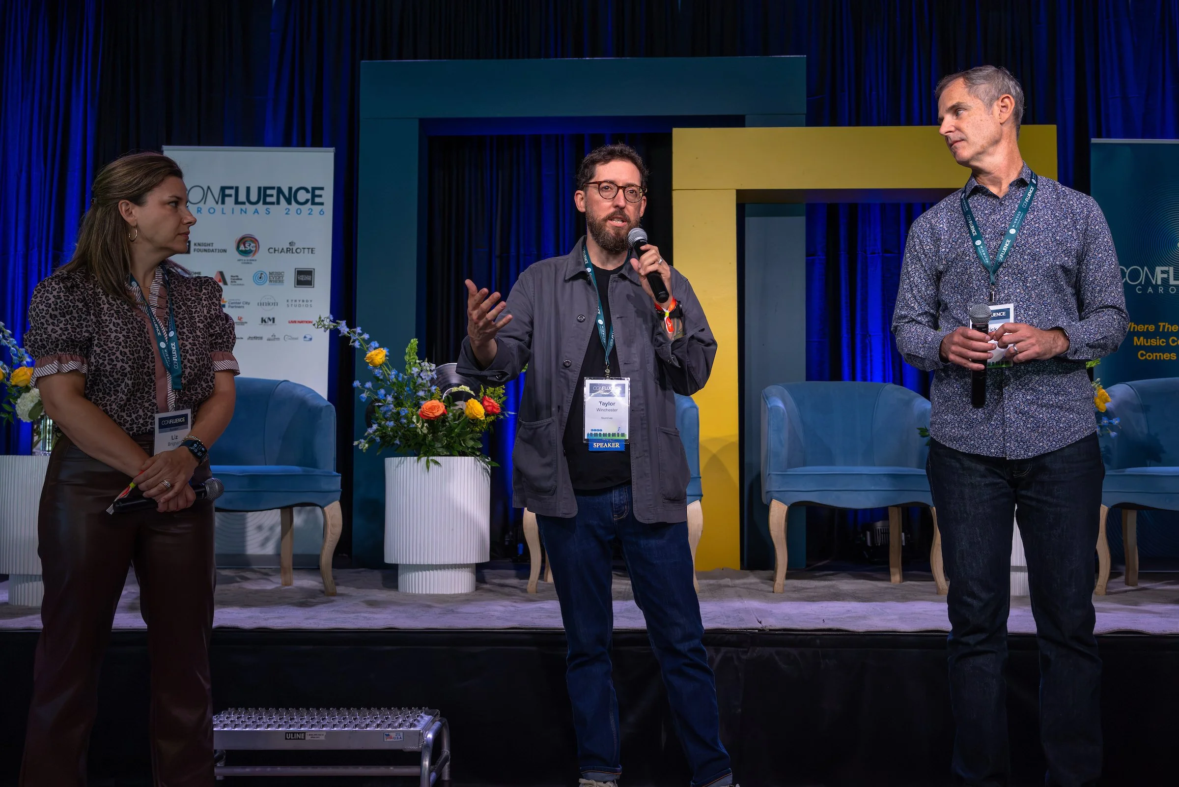

Confluence Carolinas is a music industry conference held in Charlotte, North Carolina, running since 2023. Engaged by Rick Thurmond, CMO of Charlotte Center City Partners, for the 2026 edition to refresh the three-year-old brand I’d originally designed and to separate the conference identity from its festival component, which had been underperforming as a hybrid.
The mandate: evolve what was working, sharpen what wasn’t, and build a system the team could operate independently.
Brief:
Refresh a brand with real equity without erasing it. Sharpen the conference identity for the music-industry audience it was actually serving, and prepare the ground for a separate sibling brand to carry the festival.
Three problems compounded:
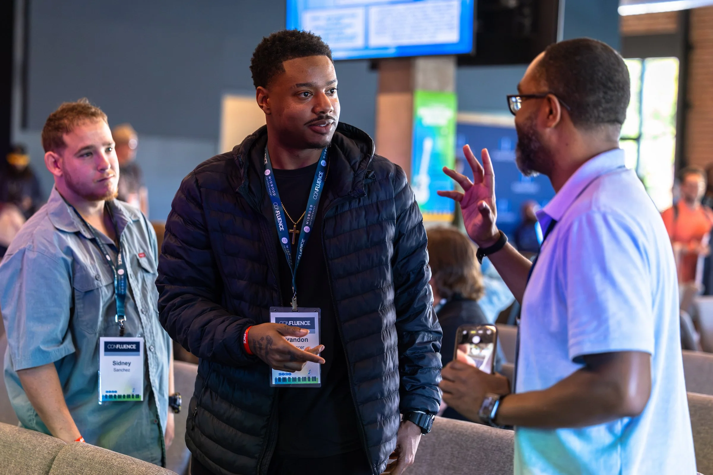
One brand, two audiences. The conference serves music industry professionals who come for panels, networking, and professional development. The festival serves general Charlotte music fans who come for live shows. The same visual language and voice was being asked to speak to both, and neither audience was fully hearing it.
The festival had a breakthrough problem. Ticket sales had consistently lagged behind the conference’s momentum. The diagnosis was not execution. It was that the general public didn’t recognize Confluence as a festival for them. The brand read industry-facing, which worked for the conference and worked against the festival.
The 2026 expansion raised the stakes. A new Saturday outdoor festival stage in South End Charlotte meant the festival had to break through to a fan audience that had previously assumed it wasn’t invited. The old brand could not carry that invitation.
Problem:
Confluence had built genuine recognition in three years, but it was carrying two different audiences under one voice, and both were being undersold. The conference was doing well with industry insiders. The festival showcases were not reaching Charlotte music fans the same way.
Solution:
Rather than refresh one brand to do both jobs, the work split Confluence into two sibling brands so each could speak directly to its audience: Confluence Carolinas for the conference, Confluence Music Fest for the festival.
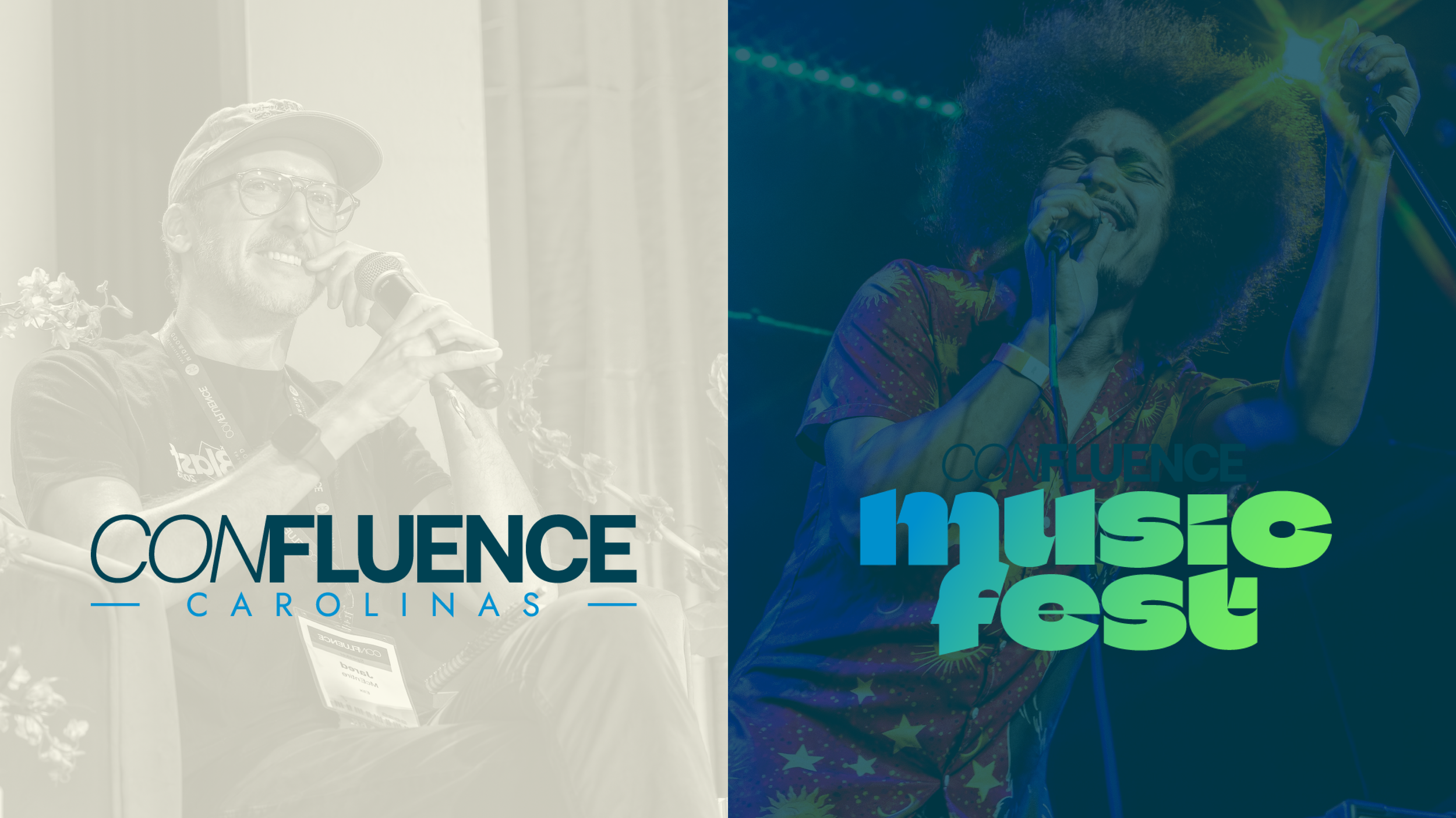
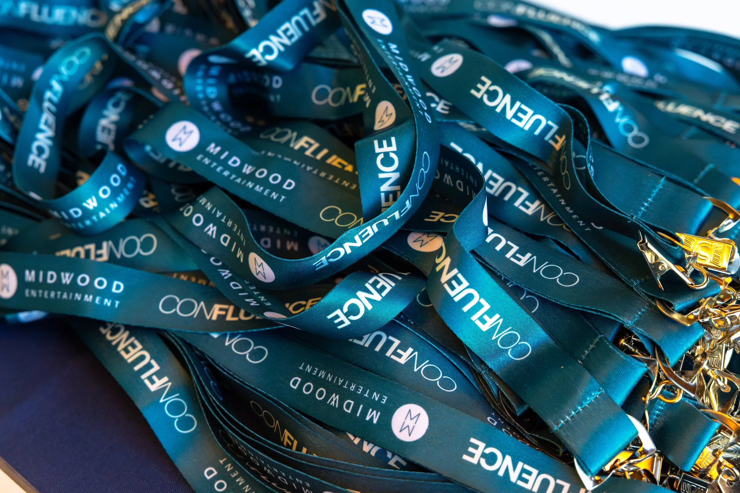
Confluence came in with real equity to protect. A three-year-old wordmark with recognition. Signage, feather banners, and volunteer apparel already in the brand’s existing blue. With the conference’s growing reputation beyond the Carolinas, any refresh had to evolve the identity without losing what had been hard-fought and well-earned.
This meant:
Preserving the wordmark in its original form. The weight orientation (CON light, FLUENCE bold) stayed, along with the core identity people had learned to recognize. Change was expressed through refinement, not replacement.
Keeping the existing blue in the palette. The signage and merch investment the client had already made was significant, and a brand refresh that obsoleted it would have cost more than it was worth. The palette expanded around what was already in use.
Deepening the voice from generic conference language to insider register. “Strategy, hustle, and hard truths, no fluff” became the north star. The brutal math of touring. Specific, direct, built for a music-industry audience that can smell corporate speak from a mile away.
Autonomous design templates. Building a brand system the in-house team and staff could operate easily without a designer in the room for every decision.
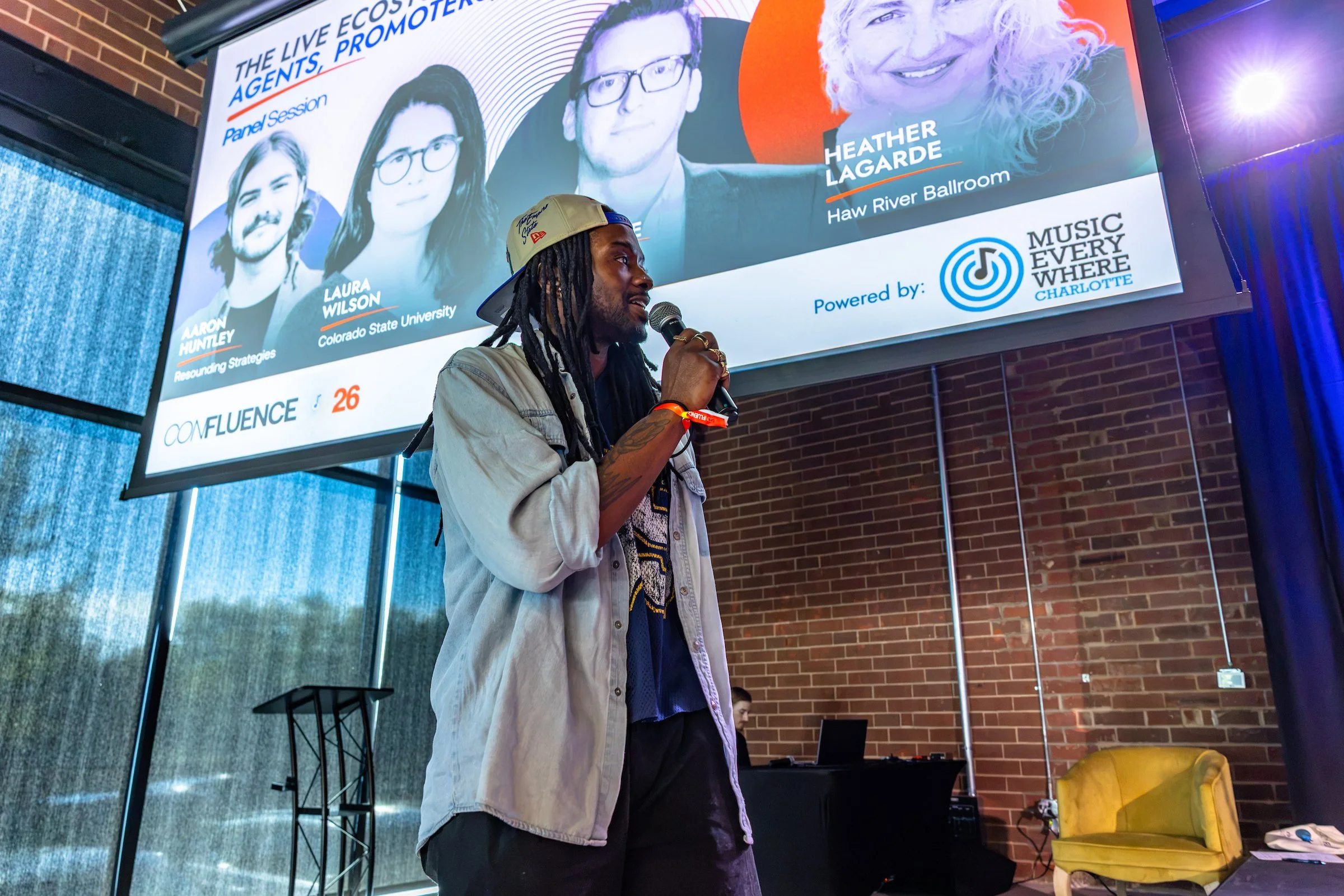

Execution Work Associated With the Solution Brand Built
Strategic Brand Audit
Ran Confluence through the full brand matrix framework (brand core, tribe mapping, positioning lab) to assess what had worked over three years and diagnose what had not. The audit established the two-audience split as the structural issue underneath every surface problem the team had been trying to solve.
Brand Guide Build
Produced a 27-slide brand guide in both HTML and PowerPoint, structured for Canva rebuild and designed for the audience that would actually use it: Casey, interns, and in-house production designers pulled in for print, merch, and signage. Rules for logo use, color pairings, type hierarchy, voice and tone, and sample applications. Not a brand bible for a vendor to reference. A working document for a team that builds daily.
Brand Identity Refresh
Refined the Confluence Carolinas visual system around a deep teal anchor replacing the previous charcoal, built a three-tier lockup system (full lockup, lockup with year, wordmark alone) to match different contexts, and deepened the palette while retaining the existing Confluence Blue for signage continuity. Added Carolinas to the wordmark itself rather than treating it as a tagline, anchoring place in the brand’s DNA.
Positioning Statement & Voice
Wrote the positioning statement that anchored the brand’s audience (“music professionals in the Carolinas and surrounding states”) and the regional claim, and codified the voice as sharp, direct, insider-coded. Translated the voice through before-and-after examples in the brand guide so the team could recognize when copy was drifting toward generic.
Sponsor Deck & Pipeline Infrastructure
Built the sponsor deck and pipeline materials for the 2026 campaign, extending the refreshed identity into the business-facing tools the team needed to execute the sponsorship push alongside the audience-facing refresh.
Typography & Photography System
Paired Aeonik Bold for display with Jost for body and support, a two-face system Casey’s team could execute in Canva without specialized font licensing beyond what the brand already owned. Established the black-and-white portrait on color block treatment for speaker announcements, giving a visually unified social presence across a conference lineup that pulls from wildly different source photography.